What values should we embody in visual design?
EMPATHY
During the transition from traditional printing to digital visual design, various techniques were developed in the current design process. These increasingly rich technical means enrich the visual senses of the audience and trigger people’s deeper pursuit of the spiritual world. For example, focus on the expression of empathy. From the straightforward pursuit of a single visual impact evolved a more implicit way of expression.
METAPHOR
The metaphor is adopted to guide the design, showing the designer’s inner world or the object the designer wants to serve. This phenomenon probably comes more from the pursuit of aesthetics by people, which has gone from one pursuit of meaningless visual impact to the pursuit of the inner world.
However, the improper metaphor for the visual design will give the audience an uncomfortable experience. For example, the metaphor of disabled people, which may be derived from some stereotype. Some people use images of animals as metaphors for people with mental disabilities. With the progress of civilization, the visual expression should be more inclusive. Even if biased images are used for metaphorical design, people can intuitively understand what the designer requires to express. The aesthetic feeling brought by visual design is never straightforward.
TEXT TO DIGTAL FORM
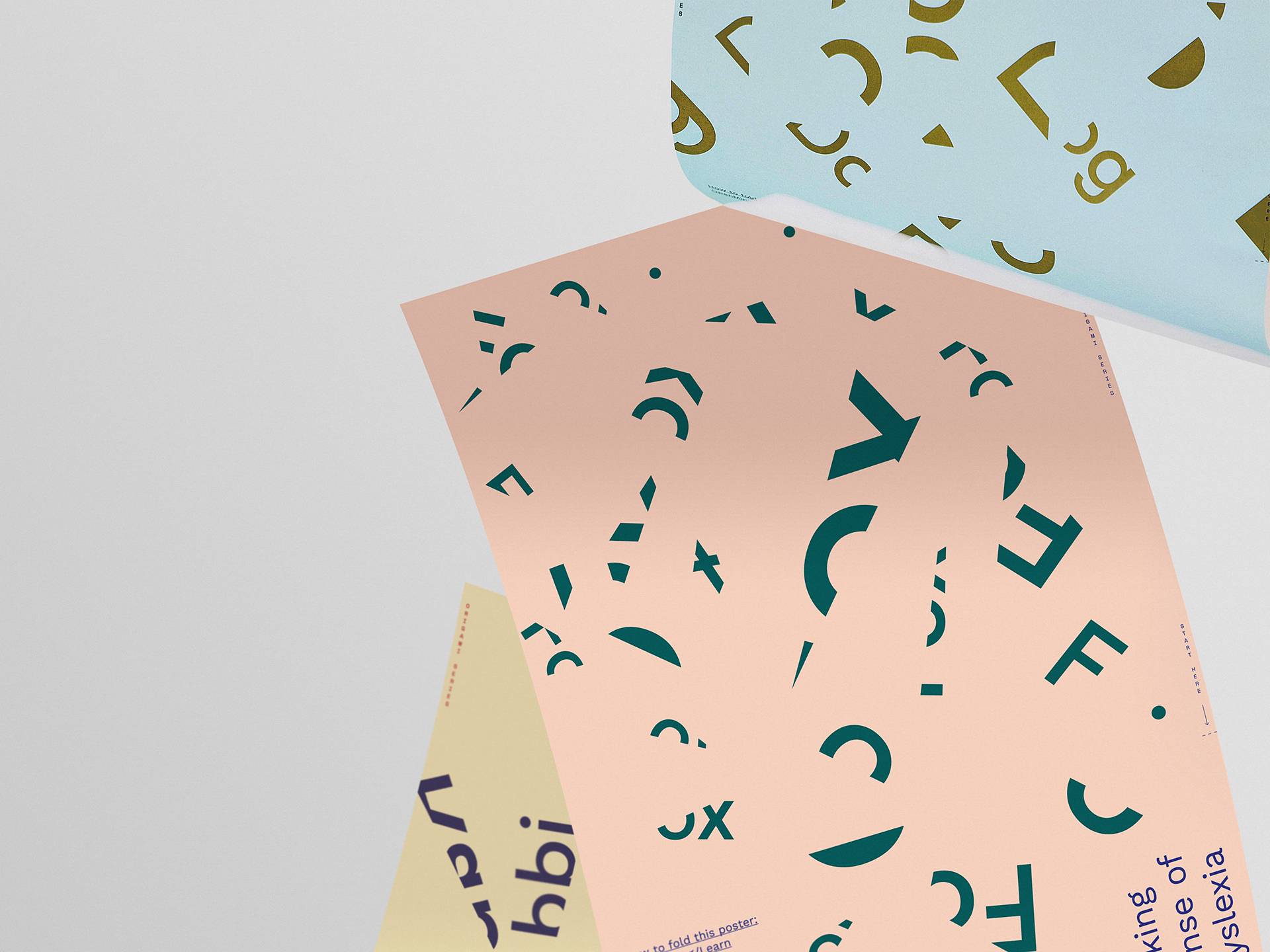
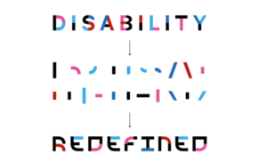
In any case, in visualizing some data content into graphic language utilizing metaphor or other means, we should consider not a single able-bodied group but a particular group that includes the disabled (physical, verbal, mental…). For instance, the logo of disabled sports designed by Superunion for Move United is a great case. Through the deconstruction of text graphics, designers use the original text “disability” to split, recombination, layout. And the addition of bright colour expression also demonstrates the visual impact.
Of course, in addition to the text of the re-split arrangement, appropriate amplification and reduction is also the right way. Different sizes of contrast can bring visual impact. Or we can adjust the shade of the colour to arrange the text. These methods are much better than using a single typesetting language.
The design should always serve people. How to better serve diverse groups while using technology to express numbers visually? How to use the presentation of technological means to help various groups better? These are questions that we need to explore. And the thinking of these problems provides a better way of guidance for our design and brings more significant challenges.
reference list
Wong, H., 2021. The visual identity for a disability sports group aims to “shatter stereotypes”. [online] Design Week. Available at: <https://www.designweek.co.uk/issues/18-24-may-2020/the-visual-identity-for-a-disability-sports-group-aims-to-shatter-stereotypes/> [Accessed 20 February 2021].